MIKROTRIP
SELF- INITIATED UX CASE STUDY // 2022

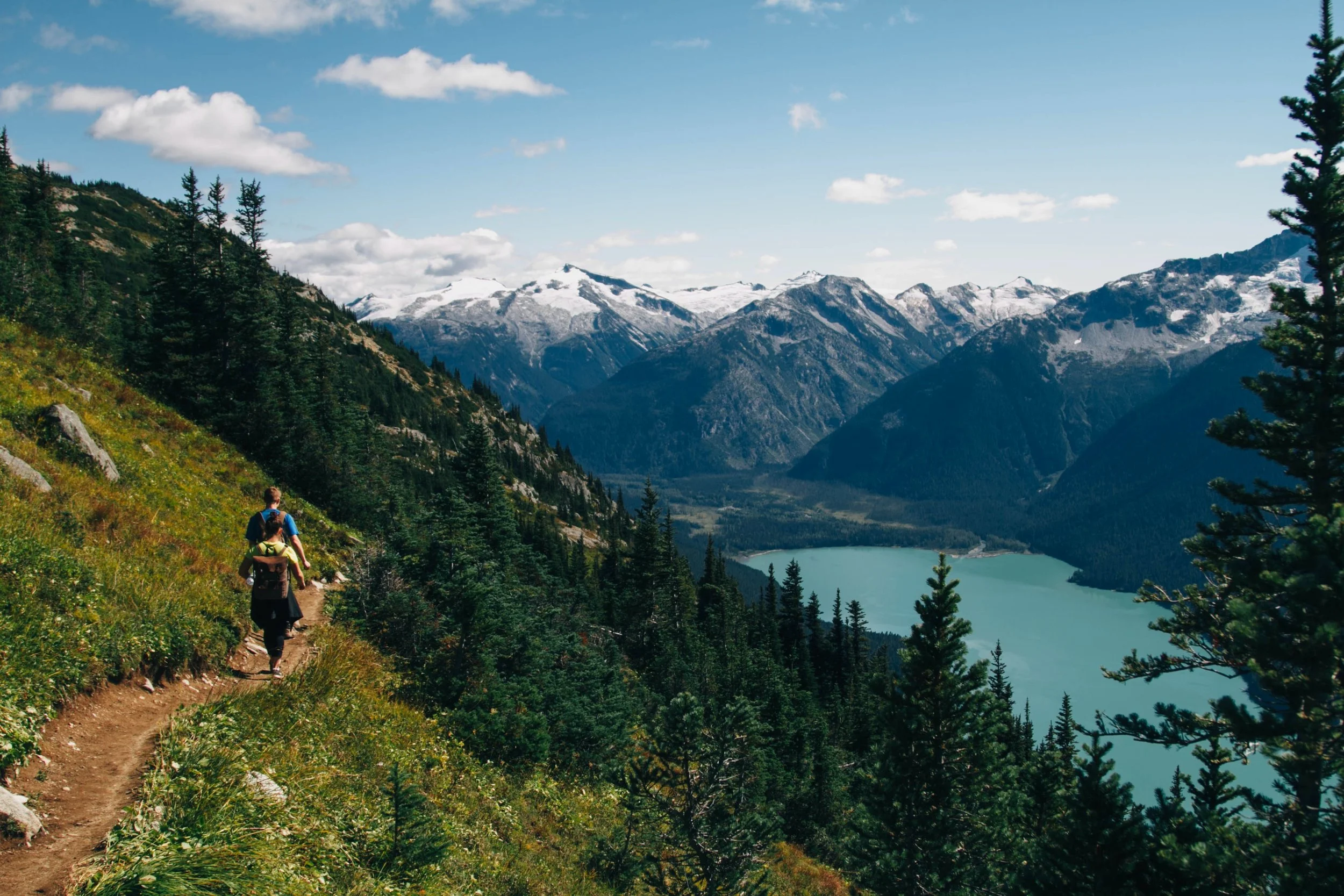
Imagining a Day Trip Generator for Wellbeing
DURATION: 12 Weeks | ROLE: UI/UX Designer | AGENCY: Self-Initiated
PROJECT OVERVIEW
Mikrotrip is a mobile travel app that encourages individuals to build the healthy habit of taking day trips.
Inspired by my own day trip experiences, I researched trip planning and work/life balance behaviors to arrive at an app-based tool geared towards helping individuals plan and execute day trips as part of a wellness routine.
Research Indicated Substantial Wellness Benefits
My white paper research indicated many young and middle-aged professionals lead busy lives that lead them to neglect the possibility of a getaway, even when they knew it would positively impact their wellbeing.
Research included articles from Psychology Today, Forbes Magazine, the BBC, Insider, and other publications.

“A 2013 survey of 485 U.S. adults linked travel to an increase in empathy, energy and awareness.”
Much like the notion that a 4-day work week can improve productivity, taking short day trips can improve energy & focus in other areas of life.

Understanding the Impact of A Wellness Routine
I conducted semi-structured user interviews of a small group to understand the user needs. Users were sourced on Facebook as working young adults aged 21-45. Interview questions were open-ended and focused on their experiences of taking day trips and their weekly routines.
Interview Insights
Subjects know getting away is positive, but struggle to find motivation.
Many lead busy lives that are difficult to pull away from.
The would, however, like to find more work/life balance.
The Takeaway
How might we encourage users to prioritize their wellness by making day trips part of their wellness routine?

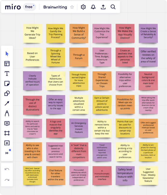
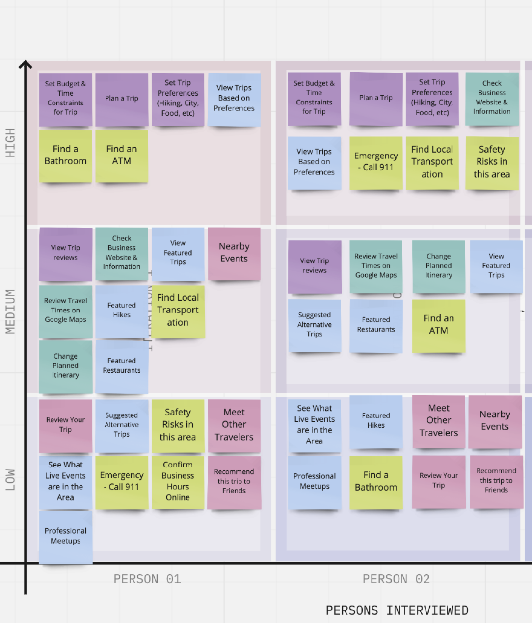
Sorting Findings
Through Affinity Mapping and Prioritization Method Testing, I discovered areas of high priority and benefits for users. I organized the research themes in Miro and coordinated a small group user test using the prioritization method.
AFFINITY MAPPING // BENEFITS OF SHORTER TRIPS
Keep costs down
Allow for a meditative break from work/home life
Less stressful to plan
PRIORITIZATION METHOD // HIGH PRIORITY FOR USERS
Quick trip planning based on preferences.
Budget & time constraints.
They want to see options, but not too many options.
User Personas
Based on research and interviews, two user personas were created. On the right you will see one of them. These user personas helped to recollect who the app design was for and what their goals and frustrations would be.

Tech Entrepreneur
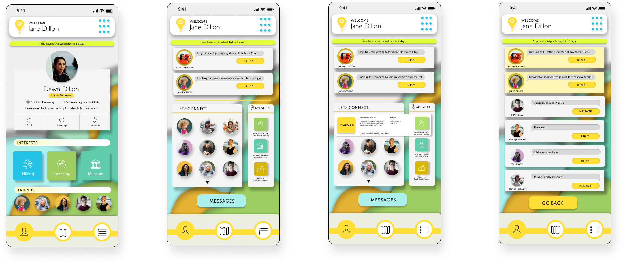
Name: Jane Dillon
Age: 34
Travel Experience: Advanced
Bio: Bio-tech professional who loves to manage her time. She enjoys traveling, exploring new areas and diverse experiences.
Frustrations:
Finding Work/Life Balance
Deciding where to go
Uncertain if experience will be worthwhile.
Goals:
To make the most of experience.
To experience something few know about.
To be pleasantly surprised.

Crypto Explorer
Name: Elias Rijuela
Age: 42
Travel Experience: Expert Backpacker
Bio: Elias lives checking out new places. He is tech savvy and adventurous. He likes to find hole-in-the-wall restaurants and off-the-beaten-path adventures.
Frustrations:
Difficulty coordinating shared experiences.
Unsure if the app suggestions are off the beaten path enough.
Does not want to waste time.
Goals:
To find the best choice for an activity.
To make authentic connections with other adventurers.
To be spontaneous and find unexpected fun.

Easy to Arrange Trips
Based on the findings from the research and prioritization method, it was clear that the app design would benefit from these key features:
An easily customizable interface to arrange trips.
Featured Trip options based on preferences.
Community features to encourage trip planning.


UI DESIGN
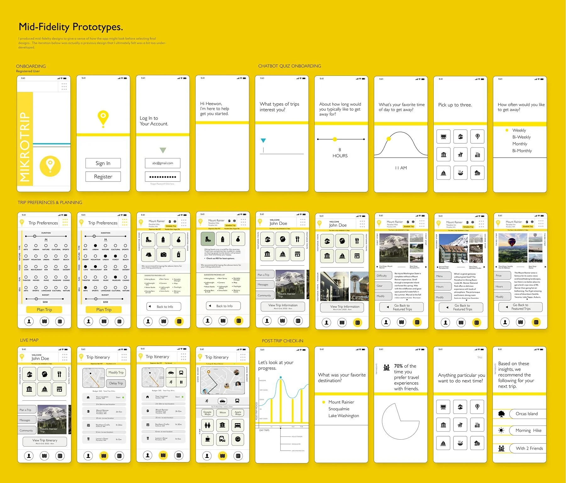
Design Iterations
Throughout the UI design process I went through a few iterations before arriving at the final designs. My final designs included a more memorable experience using vibrant triadic color branding and a dimensional flat design interface, making the app friendly and fun. Previous iterations were a bit too minimalist, monochromatic or wire-framey.

The first iteration was monochromatic and minimalist. Some user feedback revealed it lacked visual boldness and was not an appropriate choice for this app.

The second iteration was still minimalist, but featured a bold brand color. However, feedback revealed it was too wire-framey and and seemed unfinished.
Color
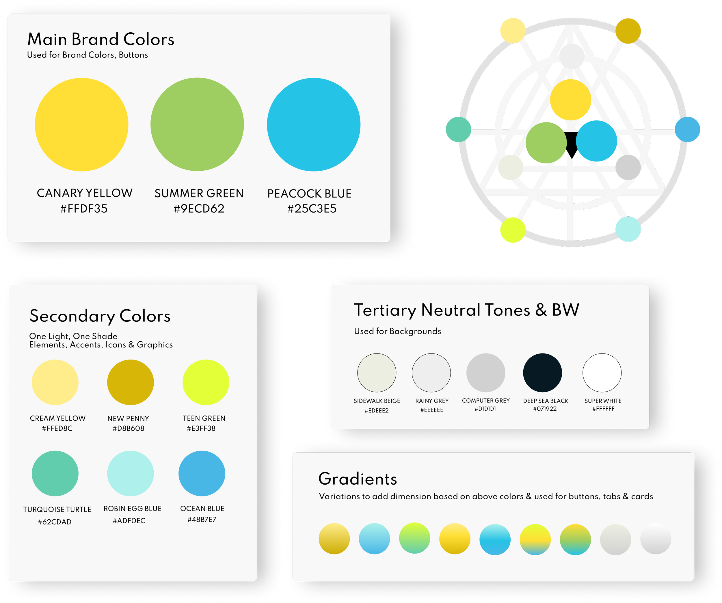
Using principles of color psychology, I chose an activating bold hue for the brand color. This was to generate warmth and guide the user through the app. Also, yellow is one of the colors that is popularly used in the arena of travel apps.
Wanting the app to feel modern and free of distractions, allowing users to focus solely on the information and booking their trip, I chose to utilize softer warm neutral and warm grey tones for background colors.
To get the contrast right I used the WCAG Web Aim Contrast Checker, since the brand yellow would be used as the background color for some buttons. To improve accessibility I also chose a tone near black (with a hint of the brand blue) for all text.
Typography

I chose typography elements based on the key design traits and influenced by some of the typography on my Moodboard. I researched “fonts like Aurora Grotesk” and came up with six options and pared them down to two selected fonts.
I chose Gill Sans and Spartan due to the clean and modern look that is easy to read and neutral. I chose a light weight font to emphasize clarity and simplicity.
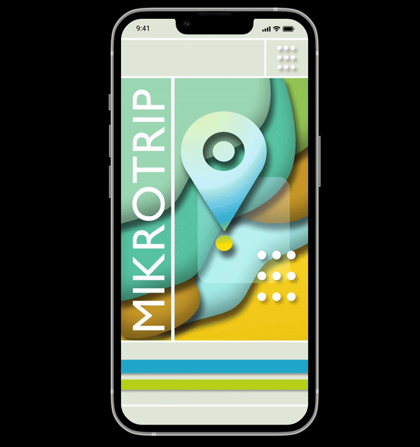
Logo
For the logo I wanted to convey the process of going somewhere (travel), as well as the destination. Ultimately I considered the pin-drop location symbol, mixed with a target and the sillouhette of a hot air balloon, symbolizing a getaway. After multiple (semi-failed) iterations detailed (to the right), I arrived at the concluding logo, which I felt should be singular, easily identifiable and scalable.

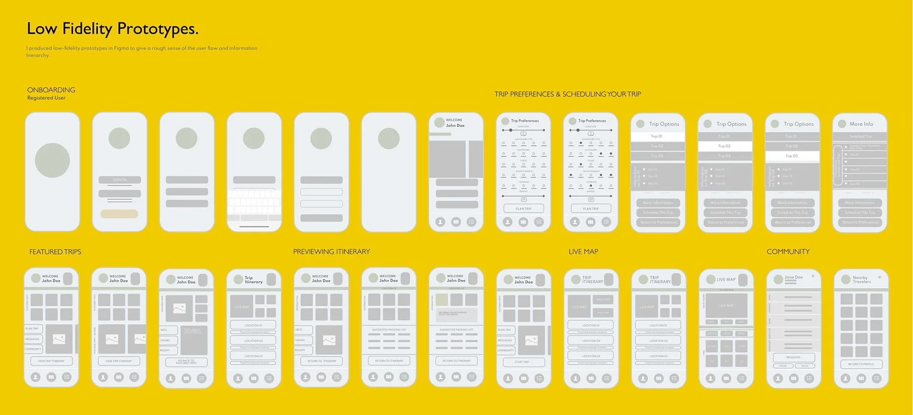
HIGH-FIDELITY PROTOTYPE
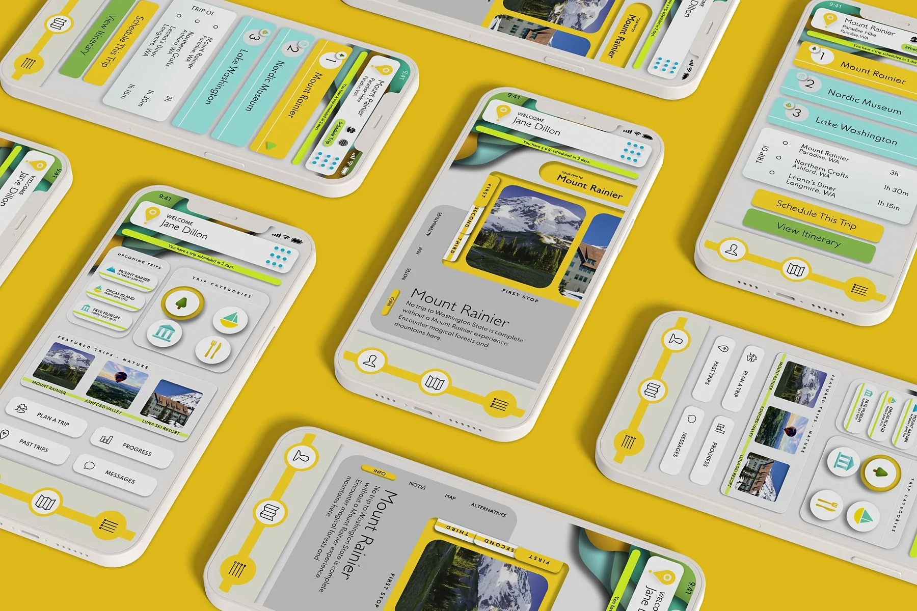
KEY FEATURES
I wanted the app to closely align with the solution of providing wellness benefits to users who planned day trips. I decided for the screens and interactions to be minimalist to reenforce trust and confidence in the AI Chatbot style interactions and for the tone of the app to be informative, friendly, accessible and easy to use.
Minimalist Design Reinforces the Solution
Chatbot Style Onboarding
Trip Preferences on One Screen
Accessible & Friendly
Curated Options for Trip Planning
No Information Overload
Live Map Feature
Emphasis on Community
Increasingly Inclusive
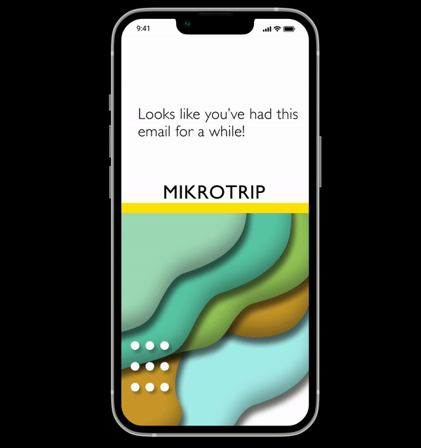
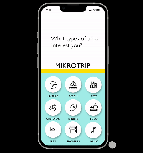
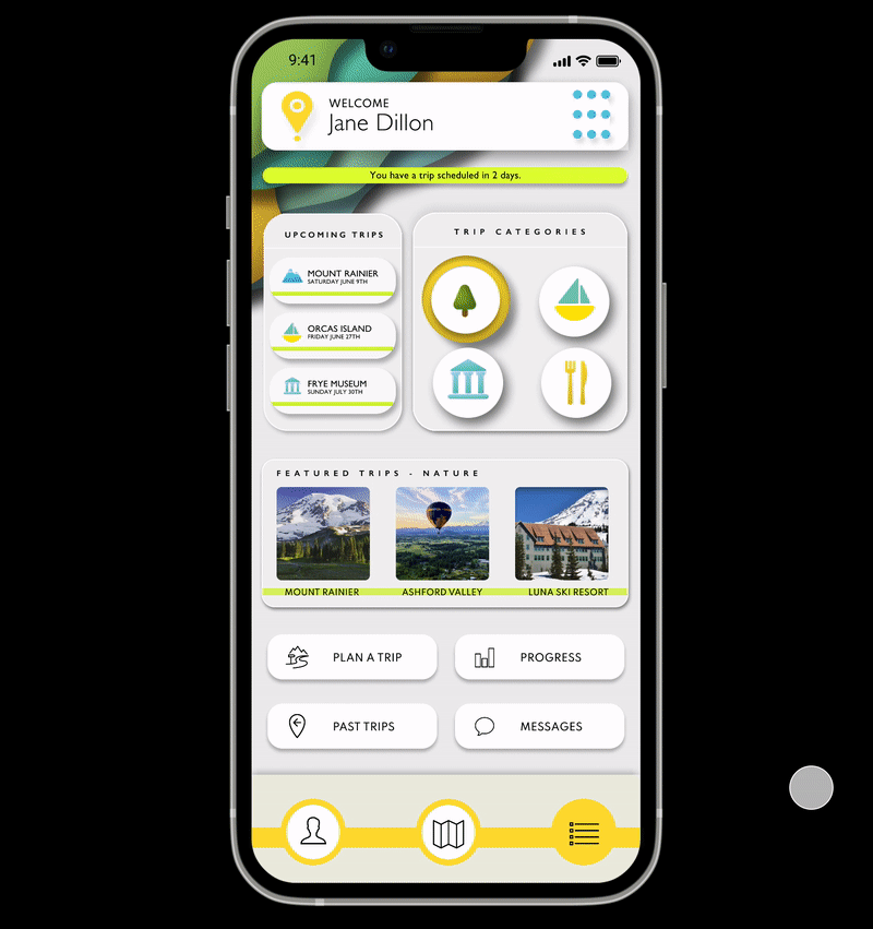
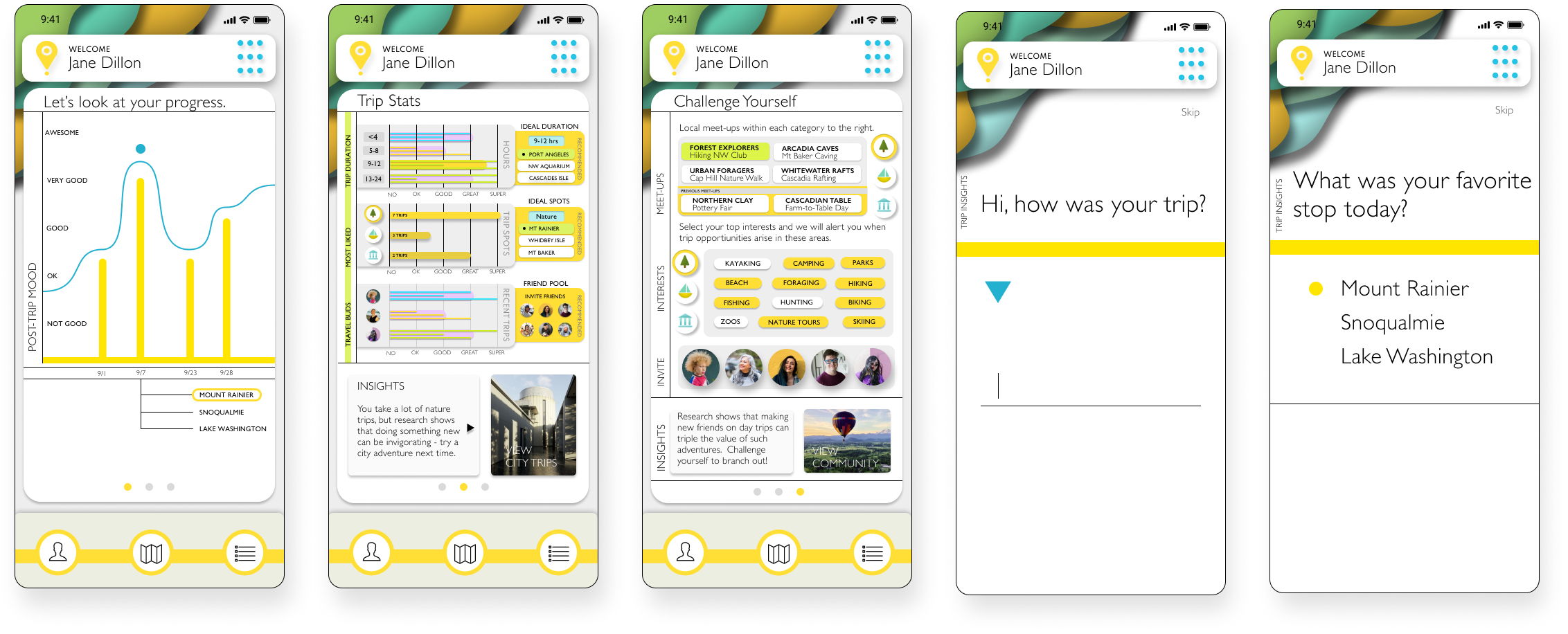
Chatbot Quiz Onboarding
Chatbot style onboarding to engage users in a way that feels natural and which builds trust in the Mikrotrip system.
FRIENDLY AI
User changes Trip preferences according to categories that appeal to them.
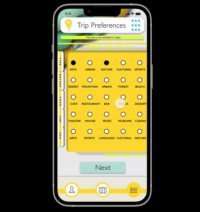
MINIMALIST INTERFACE
All Trip Preferences here can be altered via one easy screen (as opposed to the long form chatbot screens).
SIMPLE OPTIONS
Category options are limited so as not to overwhelm the user.
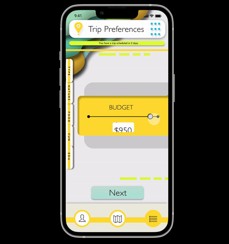
Managing Trip Preferences
A trip preferences screen all in one place to help users try different options to auto-generate the Featured Trips section.
EASILY CUSTOMIZABLE
User changes Trip preferences according to categories that appeal to them.
ALL-IN-ONE SCREEN
All Trip Preferences here can be altered via one easy screen (as opposed to the long form chatbot screens).
NO OPTIONS OVERLOAD
Category options are limited so as not to overwhelm the user.


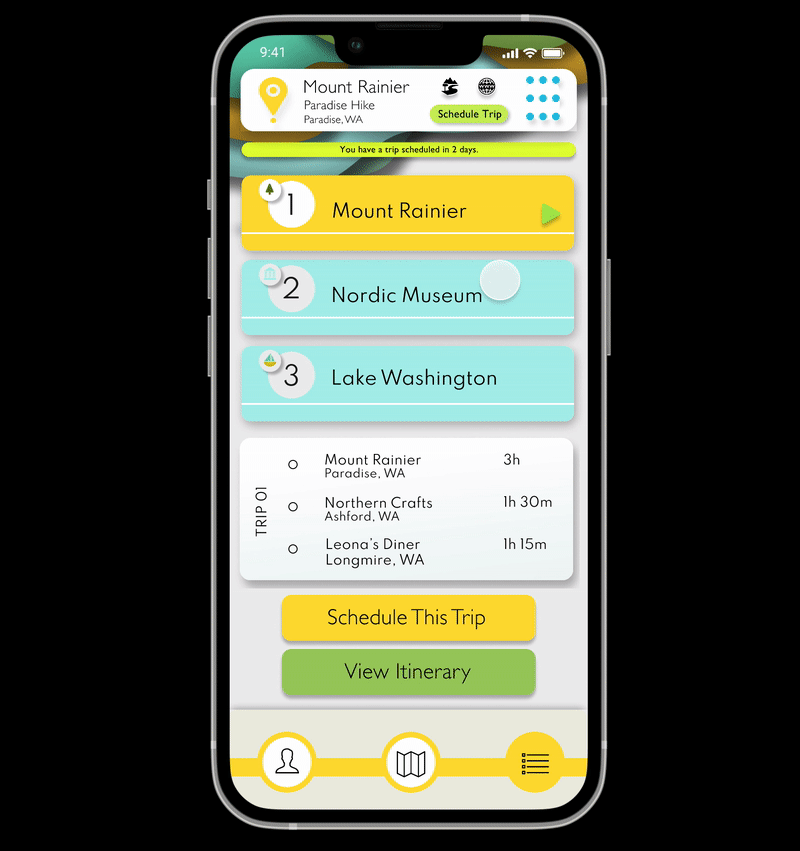
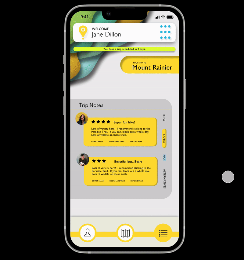
Trip Planning
Easy to use Trip Planning feature that allows user to see and preview three options before committing to their trip.
QUICK TRIP PREVIEW
At the top is the general area of the trip and in the lower portion are three stops including in the trip.
DRIVE TIMES
Users can view the Itinerary and quickly preview the drive times for the trip.
AI CURATED TRIPS
Trips are generated by AI and based on preferences, online subscriptions and location data to determine what most appeals to the user.

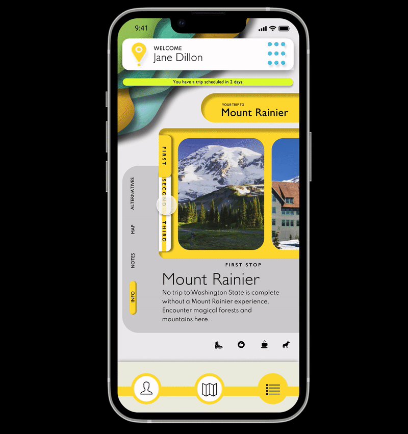
Trip Information
The Trip Information screens pack a lot of informative details about each trip stop destination and make it easy for users to digest the information of each trip stop.
ORGANIZED INFORMATION
There are many categories of information on these screens and they were clearly and simply organized using color, visual hierarchy and Gestalt principles.
MODIFY TRIP OPTION
If a user doesn’t like one of the trip stops, they can modify that trip option.
VIEW FEATURED TRIPS
Viewing Featured trips is easy to do from the main Itinerary screen. Users can select a trip category icon and they will see trips within that category.

Live Map
The App allows for users to use in-map integration or use out-of-app map services, like Google or Apple Maps. There is also a social function allowing the users to view public users nearby.
IN-APP MAP INTEGRATION
The App allows for users to view the map inside the app. They can choose to walk, take the bus or drive.
GET DIRECTIONS
Users can alternatively go outside the app and use Google Maps, Waze or Apple Maps.
FIND FEATURE
Users can find Users Nearby who make themselves public to arrange meet ups.

Community & Socializing
Band together with other users in the community - this social area allows users to make travel plans with their friends and meet with other travelers.
CONNECT VIA LIVE MAP
Users are able to connect with each other via the Live Map area, then carry on chatting in Messages.
TRAVEL TOGETHER
Users can easily make plans to travel together or meet up.
IN-APP MESSAGING
Messaging within the app allows for friendly connections and impromptu get-togethers.
Post-Trip Check-Ins
One of the key components to the success of this app is encouraging users to explore and take day trips due to their substantial wellness benefits. To facilitate this component I created two features that encourage this factor: post-trip check-ins and an Easy Trip function.
The goal of these insights is to provide useful data visualization which can help encourage users to not only take more day trips, but plan their day trips more effectively by being more mindful of what day trips positively impact users most. Through this mindfulness the app can be more useful & effective.
CHATBOT CHECK-IN
Easy and friendly post-trip check-ins by the app AI to assess mental wellness progress.
MONITOR PROGRESS
Progress indicators shown with regard to how particular trips affect the users sense of well-being.
RECOMMENDATIONS
Trip recommendations based on post-trip check-ins after considering which factors made previous trips most successful.

FINAL THOUGHTS
FUTURE CONSIDERATIONS
Showing Progress through Social Accountability
Further build out the community portion of the app and make social sharing a key component of app users wellness journey.
Refine the AI Chatbot Component
The AI Chatbot section should flow with natural ease and not seem arduous or robotic. Over time I can see this feature becoming more integrated in other parts of the app, providing useful knowledgeable stats or tips to users based on its understanding of what the user needs.
Offering More Off-the-Beaten Path Integration
There would need to be a way for the app to be able to source and find options that are less touristic, offering meet-ups or unusual hikes that users may not know about.
In the Field User Testing
Ultimately the app would need significant in-the-field user testing to determine what works.
THINGS I LEARNED
An app like this would benefit from continuous user testing and updating of its sections in future iterations. It would also be interesting to hear user stories after seeing how regular users of the app have it integrated it into their daily lives. The app would also benefit from several instances of testing in the field to find and determine new pain points for users and develop solutions.