KANGATRAK
SELF-INITIATED UX CASE STUDY // 2022
PROJECT OVERVIEW
Kangatrak is a mobile app geared towards improving financial literacy of young professionals through saving and investment challenges.
PROJECT DURATION
I worked on this project for 12 weeks.

MY ROLE:
UI/UX Designer designing an app from conception to delivery.
RESPONSIBILITIES:
Conducting interviews, paper and digital wire-framing, low and high-fidelity prototyping, conducting usability studies, accounting for accessibility and iterating on designs.

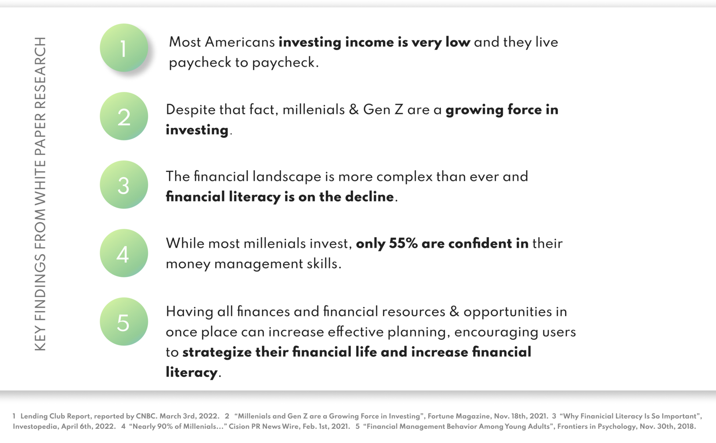
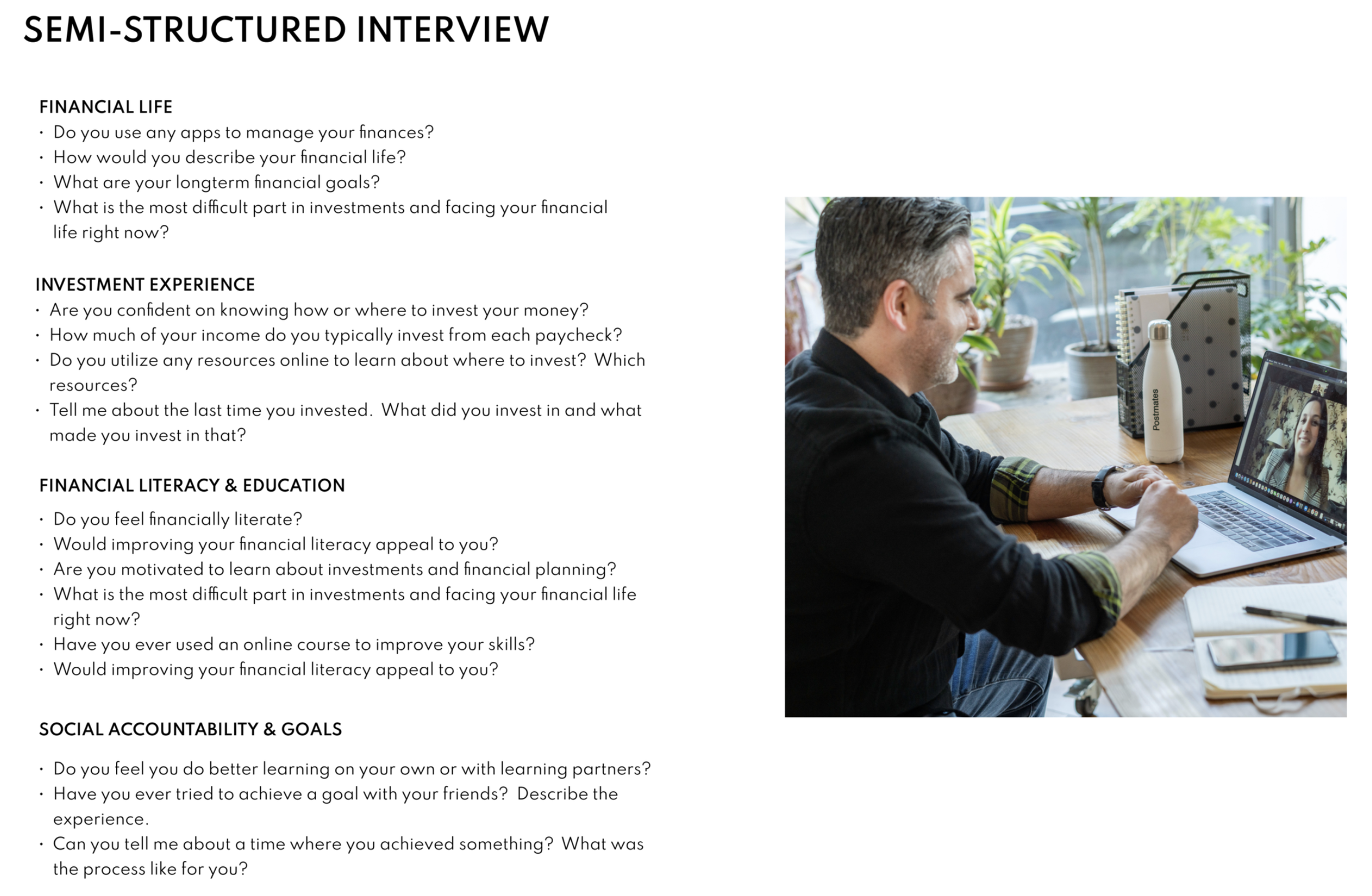
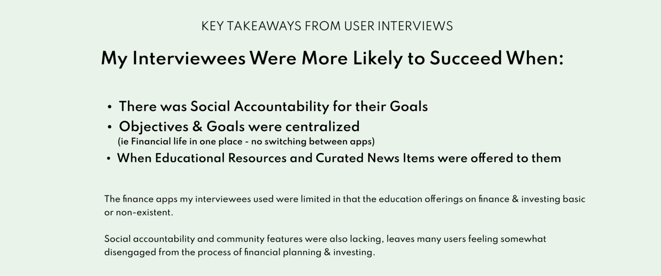
User Research: Summary
I conducted white paper research and semi-structured user interviews to understand the needs of the users I am designing for. A primary user group identified through research was working young adults aged 21-41 who have little or no experience with investing.
This user group seemed to confirm an initial assumption that they would benefit from having all their financial life and resources in one place, with the opportunity to learn from investment and savings goals.
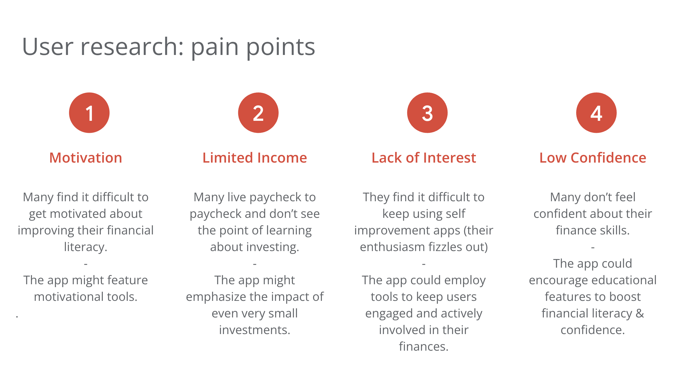
This early research also revealed that users struggle to stay motivated and stick to their goals. While each of the participants were enthusiastic about being more serious about their finances, some questioned whether they could stay committed to investing for the long term.

“I just want to do more with my money than have it in my bank account and I don’t really know where to start!”
Heewon is a Gen Z Software Engineer that wants to make the steps to ensure she has a successful financial life. However, she doesn’t really know where to begin and she also loses interest easily. She’s hoping she can find the motivation and knowledge to help get her started on a successful financial future.
GOALS
To know more about investing.
To feel more confident with her money management skills.
To see the impact of her new skills and financial choices.
FRUSTRATIONS
Has trouble staying motivated with regard to finances.
Struggles to stick with her goals.
Easily loses interest after a while.

User Journey Map
Mapping Heewon’s user journey revealed how helpful it would be for
users to have access to a dedicated finance literacy app.


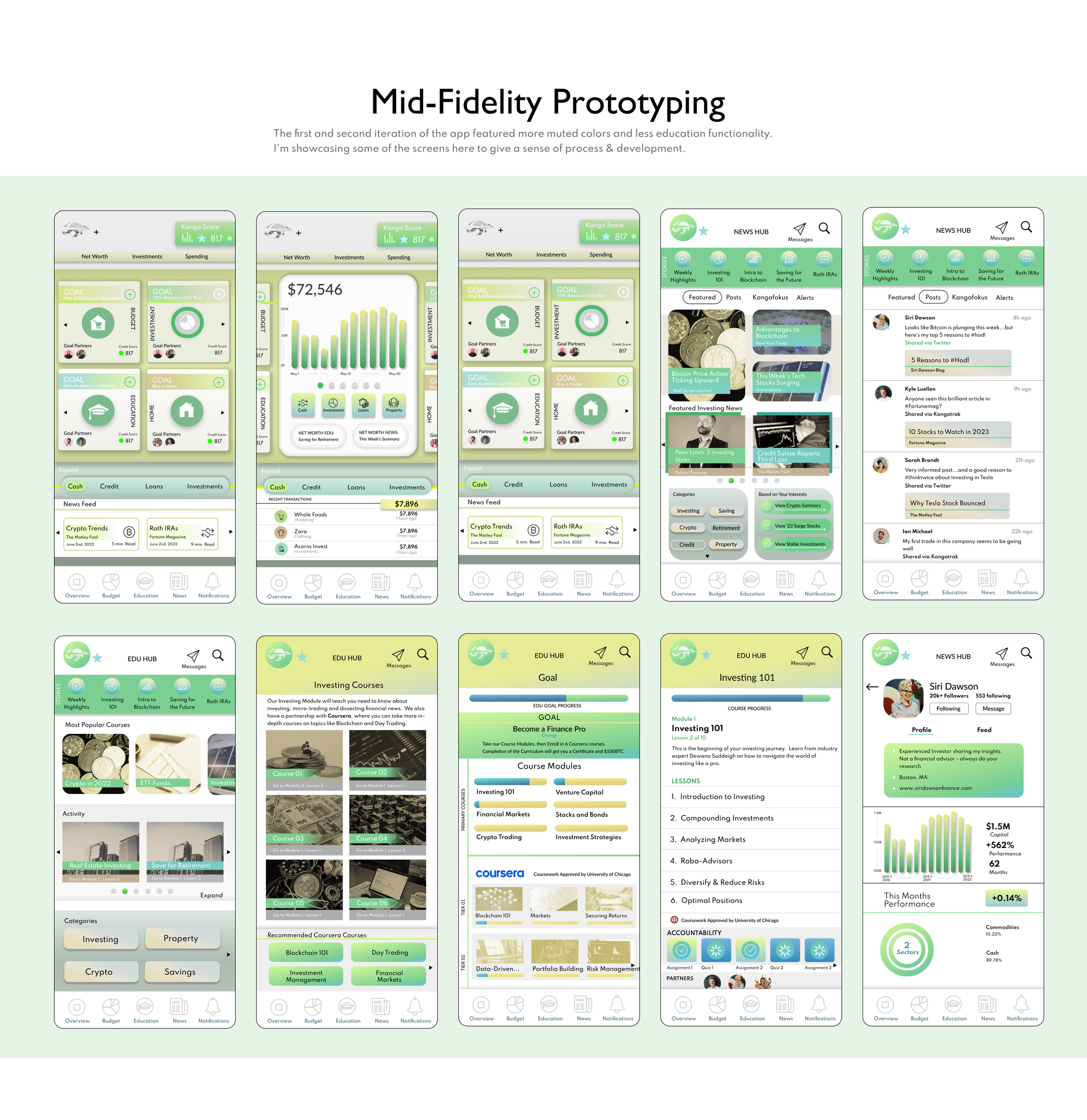
Paper Wireframes
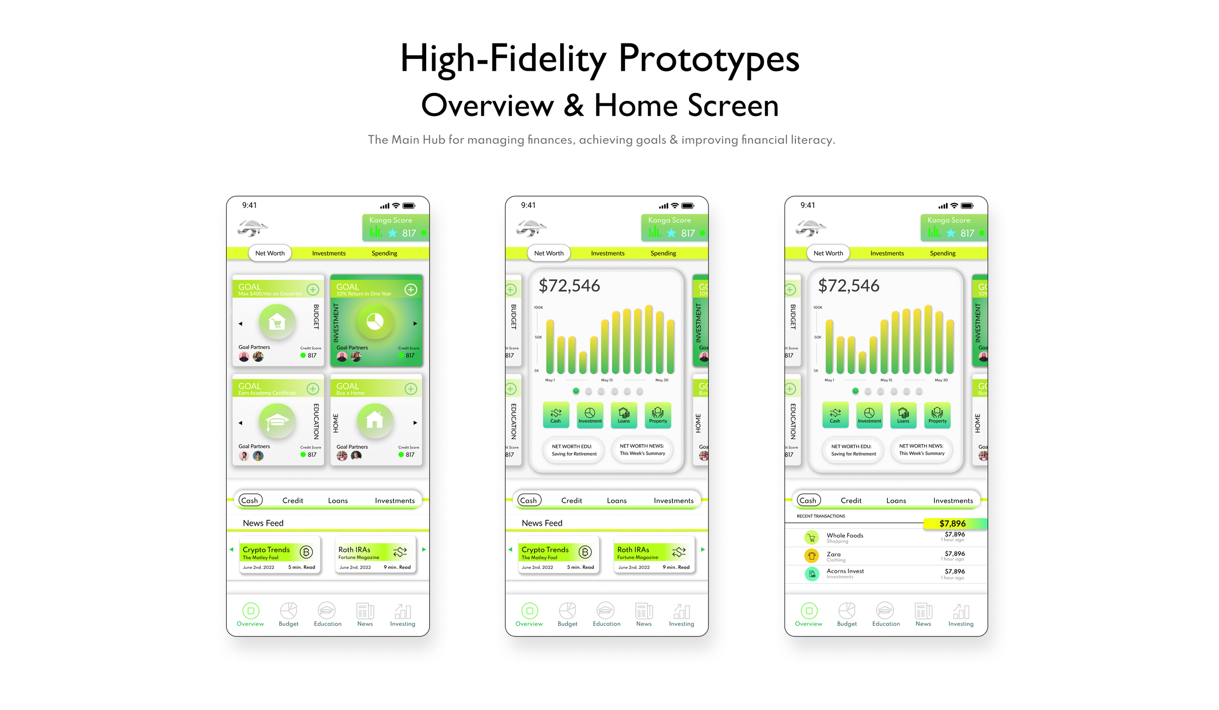
Taking the time to draft iterations of each screen of the app on paper ensured that the elements that made it to digital wireframes would be well-suited to address user pain points. For the home screen, I prioritized a quick way for users to check investments.

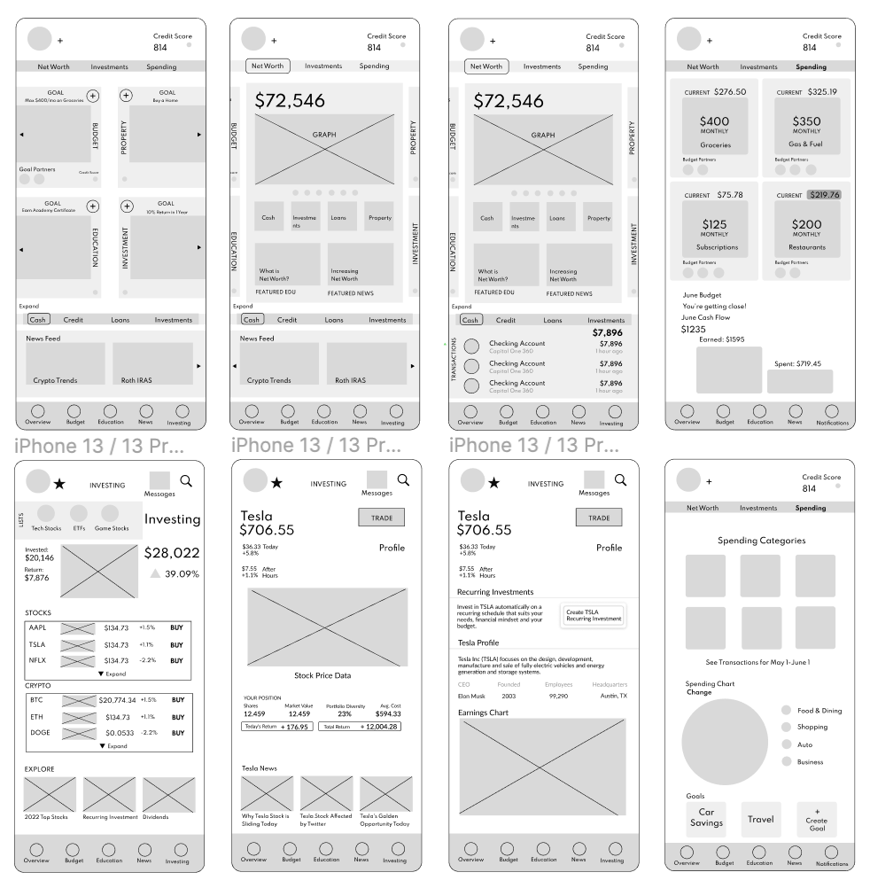
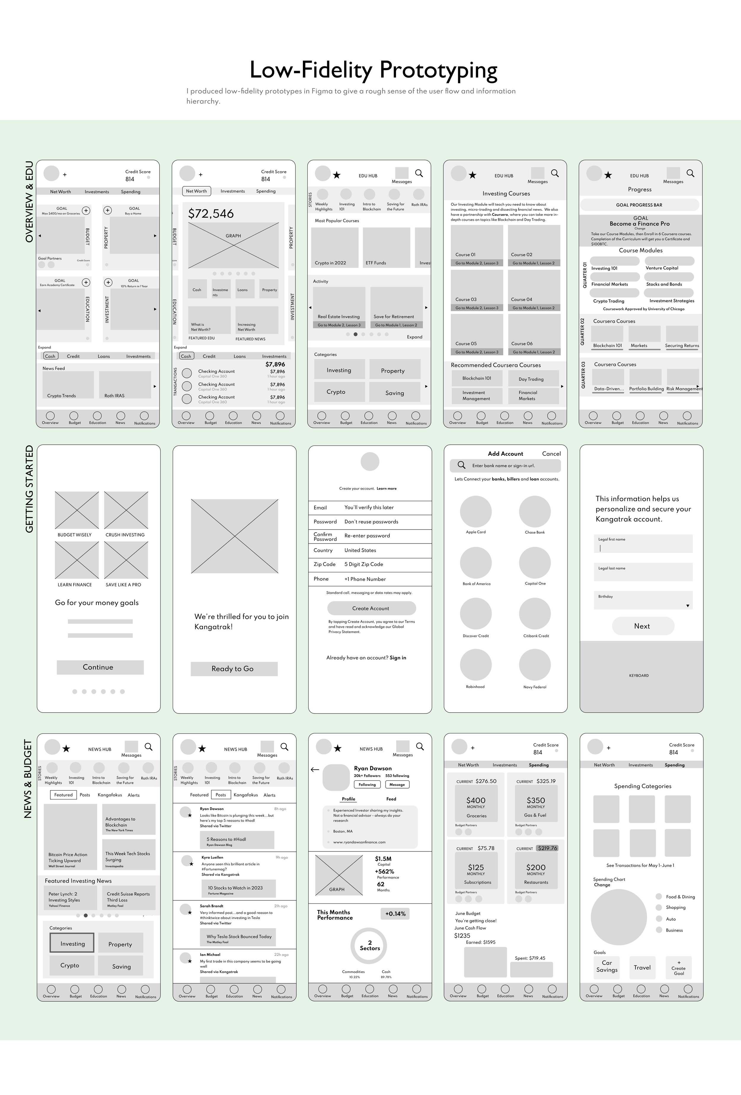
Digital Wireframes
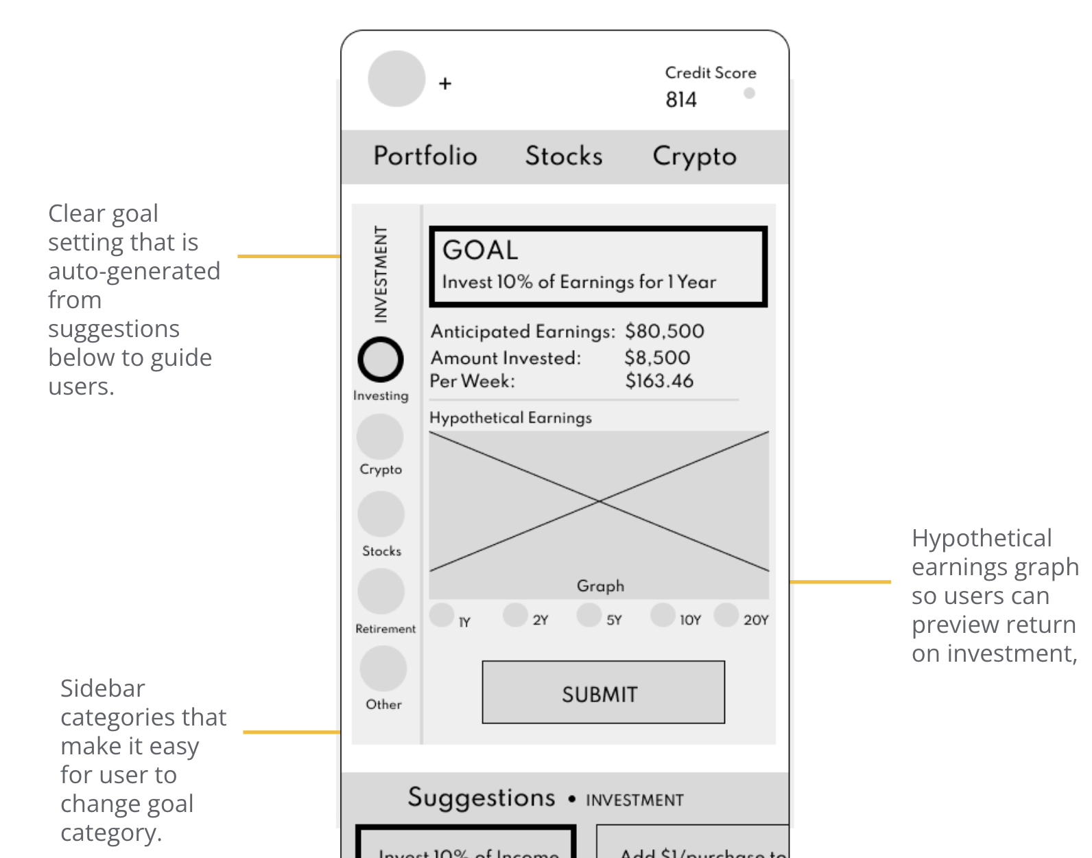
SETTING A GOAL
I I focused on the main user flows and kept the screens clear, informative and easy to navigate.

Digital Wireframes
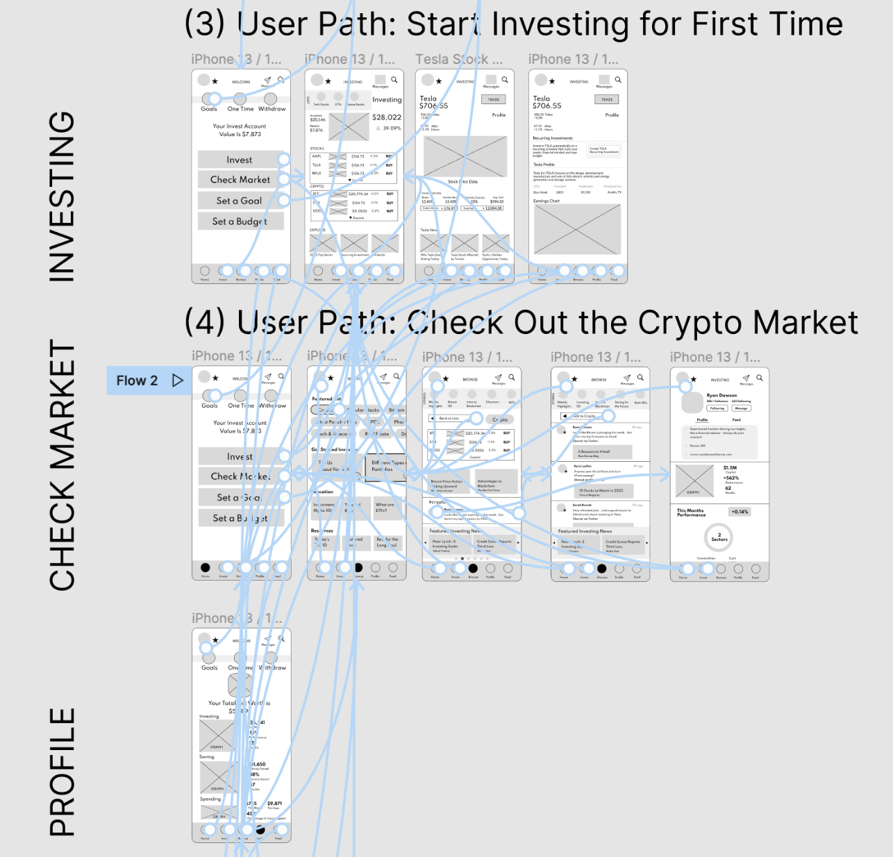
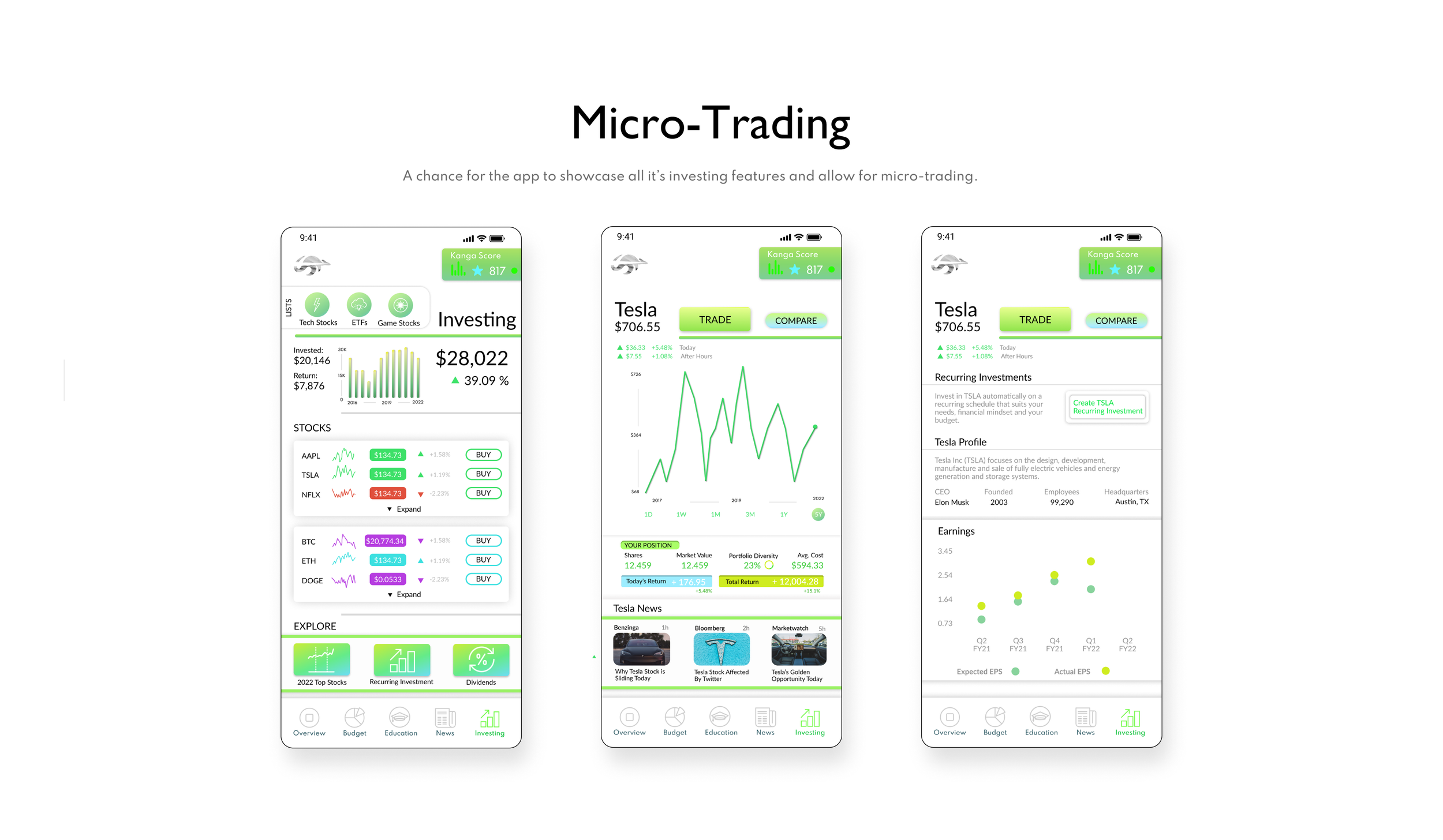
INVESTING FOR THE FIRST TIME
I tried to keep the wireframes straightforward, clearly giving important information, while also educating newer users and providing more detailed info to more experienced users.
Digital Wireframes
BUILD KNOWLEDGE
A core part of the app problem is to improve financial literacy. This is incorporated through small guiding icons and slides that educate users about investment opportunities.
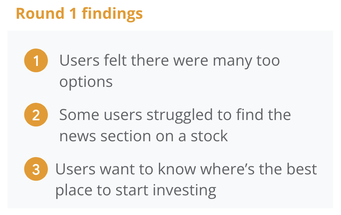
Usability Study Findings
I conducted a small usability study, recruiting 5 participants, including two males, two females and one non-binary individual. My participants also included different racial and ethnic backgrounds.


Digital Wireframes
FOCUSING THE PRIMARY USER PERSONA
I realized after the 1st round that I would have to refine my target user base - I decided to focus on 1st time young investors. The app could cater to more experienced investors, but for the purposes of the study my focus was on those new to investing.

Digital Wireframes
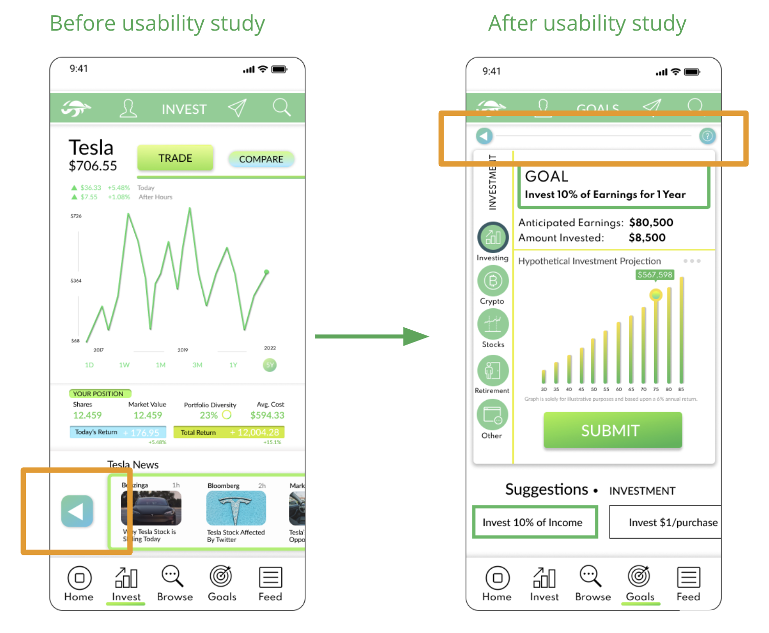
IMPROVING THE NAVIGATION
It was clear after the usability study that the app was providing too many navigation options and what the app was trying to offer was not clear. I removed and rethought the Education and News Sections and incorporated these components into the sections on Investing.

Digital Wireframes
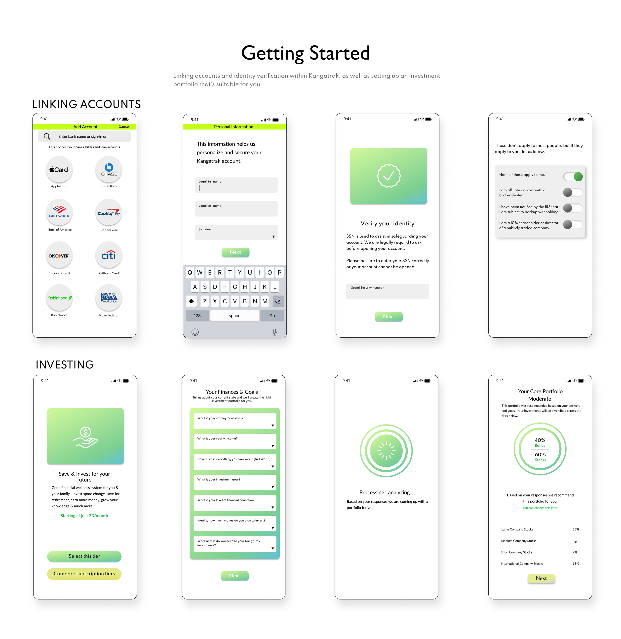
HELPING USERS GET STARTED
Originally starting the app was found to be a bit daunting for first time investors. I simplified the home screens to clearly provide guidance for certain Jobs to Be Done and help users focus on their tasks within the app.
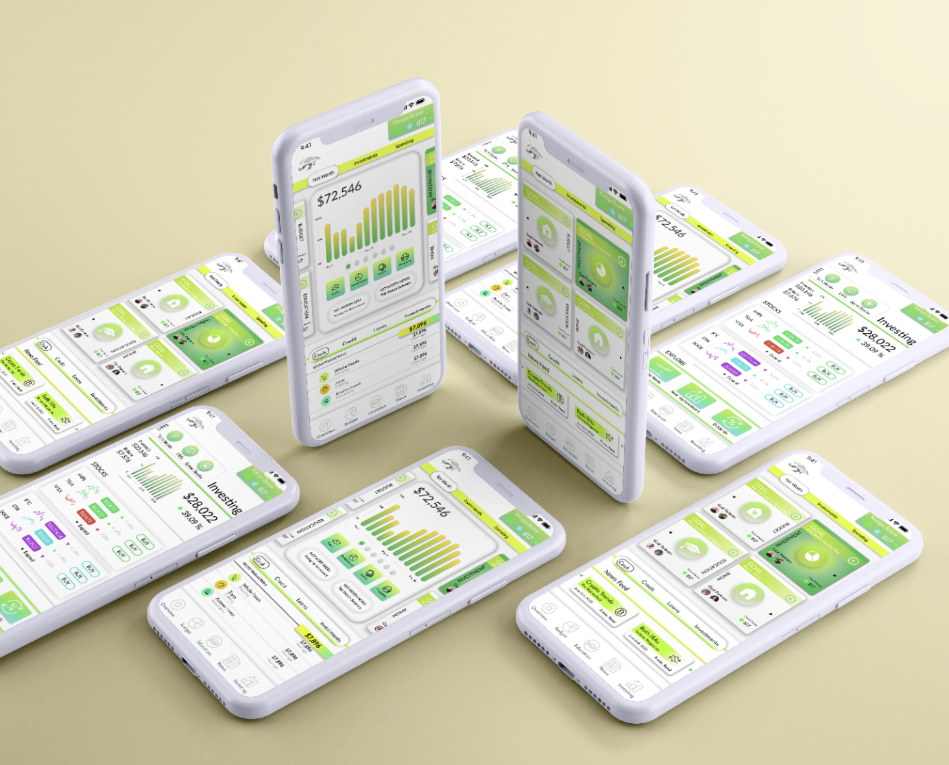
Mockups
CREATING A HELP BAR
Originally I knew that I would have to incorporate a Back button to improve navigation for users, but it was unclear on where to place that. User testing also showed me the need for a Help Button. I ultimately improved the design by placing these features at the top of each screen.

High-Fidelity Prototype
The final high-fidelity prototype presented cleaner user flows for getting started with investing. It also met user needs for an app more focused on investing and for guidance within the navigation.


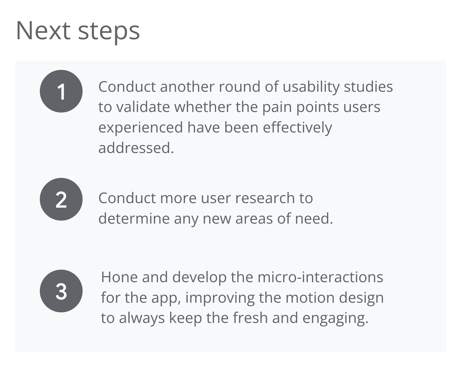
Appendix
