BILLWISE
SELF-INITIATED UX WRITING PROJECT // 2022
Billwise is a mobile app platform that helps manage bills for individuals.
A main challenge of designing content for FinTech industries is the prospect of clarifying complex systems, making financial processes easy to understand and maintaining trust and simplicity throughout the process.
1 - ADDING THE USER FLOW
ROLE: UX WRITER
A highly impactful part of the process of managing bills in Billwise is adding bills to the home screen. This process enables users to set up bill auto-pay all in one place and to keep track of their budgeting process.
I developed the content design for the add bill vendor flow as a core component of my responsibilities.
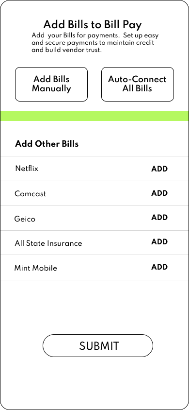
My feedback after this first iteration:
The wording isn’t clear about whether “Adding a Bill” equates to “Setting up Auto-Pay” with a Bill. This is confusing and can lead users to think they either have to set up auto payment or not add a bill to the platform.
There is no mention of the Platform (“Billwise”). Instead, the section refers to “Bill Pay”. This is also confusing because it is not clear how the platform organizes bills and automatic bill payments.
Simply indicating “ADD” doesn’t make sense if a bill is already added and they return to this screen.
“Auto-Connect All Bills” is redundant and confusing, since user might not know what “All Bills” means.
Overall, the content could be better organized on this screen and also reinforce the benefits of why users might want to set up their bills as auto-payments.
REDESIGN CONSIDERATIONS
Add benefits of automatic payments.
Let user know they don’t have to set up automatic bill payments now.
Let users know they can add bills without setting up automatic payments.
2 - THE REDESIGN
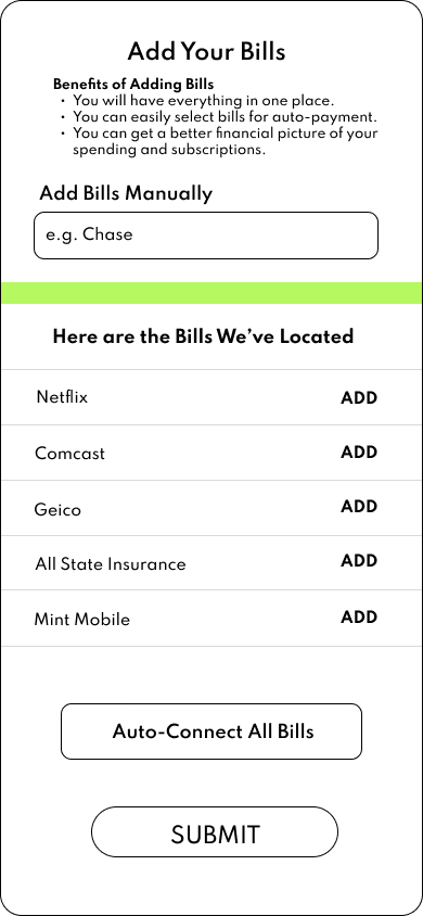
The updated content design has a clearer user flow, allowing for users to feel more confident navigating this screen.
At the top, users can preview the “Benefits of Adding Bills”, which clarifies the purpose of this screen.
The second portion better explains for users that they have more bills that are not listed.
IMPROVEMENT CONSIDERATIONS
Improved functionality in the lower portion, which would allow users to add a bill and/or employ automatic payment.
The example abbreviation (e.g.) might not be clear for some users
“You will have everything in one place” proposed as a benefit could be further explained.
3 - FINAL ITERATION
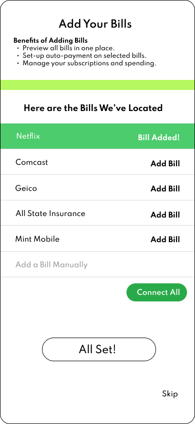
The final iteration of this design features a much clear user flow, along with being more concise.
At the top, I strengthened the language by making it more concise and more active. I did this by starting each sentence with a verb that quickly offers users a sense of the benefits.
The bottom section is clearer by assigning the “Add a Bill Manually” section in grey font to the “Bills Located” section. It is also more clear how users can go about connecting all the listed bills via the CTA (“Connect All) green button.
If users want to set-up auto payment they can do that on the following screen, making this screen solely about connecting the bills to Billwise.
Furthermore, if users wish to skip this screen entirely they can do so via the “Skip” button I added.
Lastly, once users are ready to advance, I employed less robotic and more colloquial language by using “All Set!” rather than “Submit”.
CONCLUSION:
It would be necessary to now test these screens and variations to see what works best in real-life scenarios. Questions to consider would be:
Do users tend to skip these screens?
Does the completion rate of these screens change at all versus previous iterations?
Does user feedback inform us that these screens are clear and informative?